
De brabantse tafel
Jochem Vogels
on the mic
Starting a new business, where on earth should I start? I wanted to achieve a fresh, professional and, above all, clean look that was clear to all audiences. All this with a slightly different design and experience from what you already find a lot of on the market. Well, Rubberplants | Digital Agency succeeded in that I can tell you.
“So cool to work with Rubberplants to build my new company and brand. The start is made and the response from the market is very positive. Together we will continue to expand this, because everyone deserves to be able to enjoy a healthy and tasty meal!”.
THE PROCESS
GET Ready.
As a Digital Agency, we start by delving into the roots, identity and growth goals of the new brand. Through brainstorm sessions, we sit down to get to know De Brabantse Tafel. After all, it is a completely new company and brand. How cool to be involved in this new Brabant brand from birth.
100% new brand
strategic & creative
Setting up a new brand is something special, something strategic.
It is exploring the opportunities to market the brand and story in a unique way. Standing out among the other providers, by combining Burgundian Convenience and Brabant coziness and hospitality.
tastey story
Thanks to the built-up brand key model and the various brainstorming sessions, the unique story of De Brabantse Tafel has been captured.
Our team of strategy, creation, design and development explored the identity of De Brabantse Tafel. To roll this out throughout communication, appearance and all channels. That unique creative touch that reflects the strength of De Brabantse Tafel and can also be used to achieve brand growth.
De Brabantse Tafel wants to give everyone the opportunity to enjoy a healthy and tasty meal.
Burgundian convenience
De Brabantse Tafel
The name alone evokes the feelings we want to convey: cosiness and friendliness. Through the pay-off Burgundian convenience, this feeling is reinforced and the service-oriented facet is also emphasised. It is the ease with which these delicious meals can be ordered and delivered.
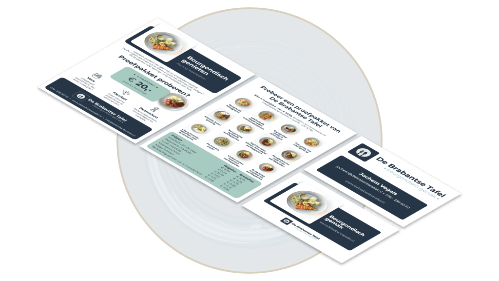
We quickly decided upon the colour scheme for the logo, the trustworthy blue combined with fresh aqua marine. By working with the round shape (the plate) and the fork and spoon in the logo, the link is made to meals. The same shape is also reflected in all images on the website and printed material, making it a consistent look. We capitalise on calmness, luxury and confidence to stand out among the competition.
the new corporate identity
The core message, positioning and image has been rolled out throughout the organisation. We highlight some facets in more detail to give an idea of where strategy, creativity and design come together.
From offline to online
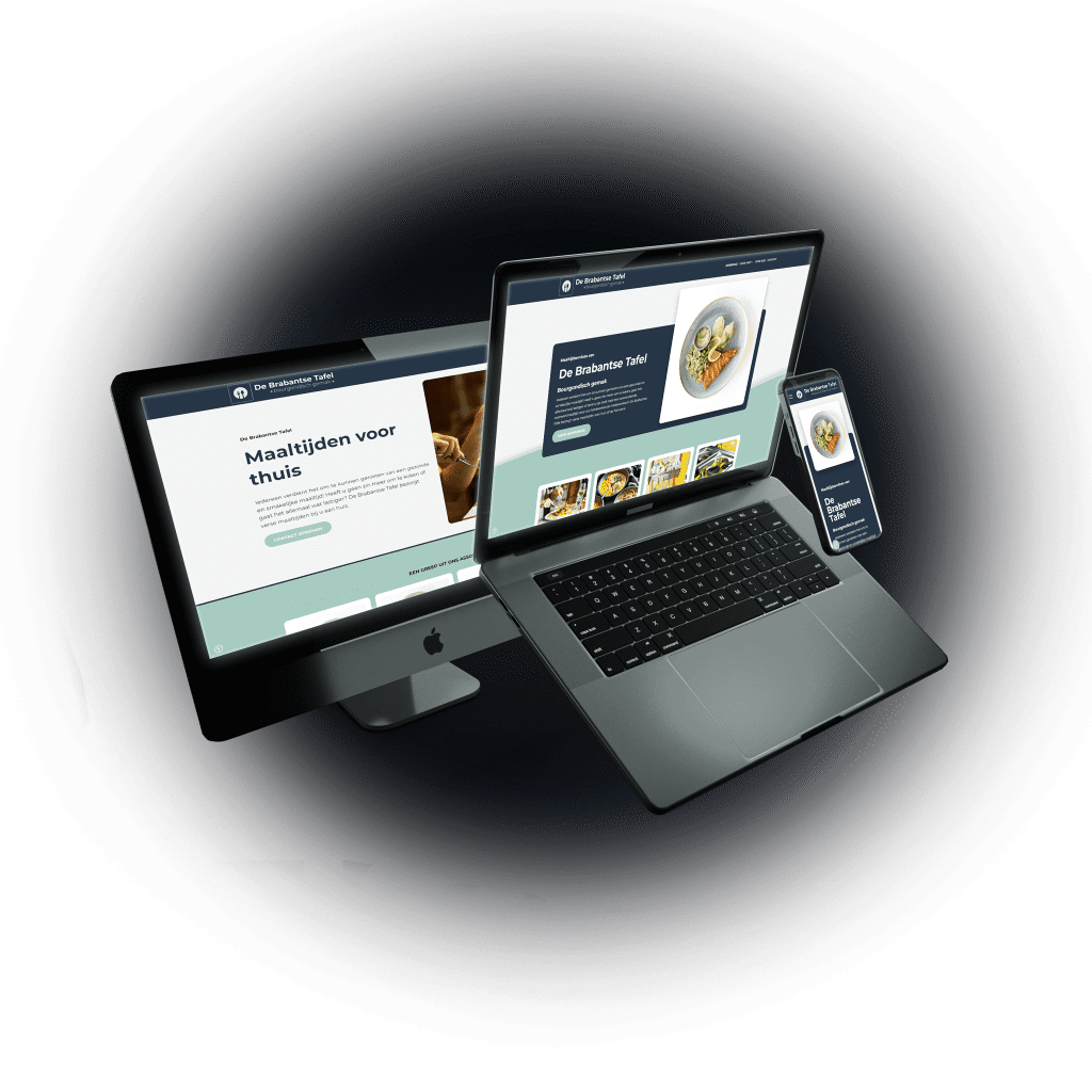
Website
The corporate identity and graphics have also been implemented into the website, of course. Thus, we extend the fresh and distinctive look of offline to online and ensure a consistent look and feel.
The target audiences are clearly displayed. The custom-made website of meal service De Brabantse Tafel is built in WordPress and fully responsive, ensuring a fine user experience on all devices.
tasty result
Het resultaat van dit gave nieuwe merk mag er wezen en hier zijn wij dan ook heel trots op. Wij bedanken De Brabantse Tafel en Jochem Vogels in het bijzonder voor het in ons gestelde vertrouwen. Wij kijken uit naar een mooi begin om zo samen verder te groeien.
READY TO GROW?
Wil je jouw case, uitdaging of groeikansen eens samen met ons bespreken, geheel vrijblijvend? Daag ons uit en plan een afspraak in of neem contact op.