Eelco Dielemans
on the mic
Why do you want to rebrand? This was the first question we were asked. We wanted to have a new fresh, professional and corporate look achieved through a rebranding. All this while retaining personal character. In short, a new corporate identity, appearance and website.
“We are really happy with the strong and well thought-out identity and look.
From our branche, we get a lot of positive feedback”.
THE PROCESS
GET Ready.
As a Digital Agency, we start by delving into the roots, current identity and growth goals. Through brainstorm sessions, we get to know C4U even better. With all these valuable insights, we are ready to start the rebranding process.
rebranding
strategic & creative
A rebranding journey is something special, something strategic.
You have to look for that extra touch that makes the brand story unique. Exploring the words and creative touch that consistently get the message across. To then translate these from the brainstorm session into the look and feel of all the brand’s channels.
the story
Dankzij het opgebouwde brand key model en de verschillende brainstormsessies is het unieke verhaal van C4U vastgelegd.
C4U is een betrokken full-service ICT partner die professionele dienstverlening combineert met een persoonlijke touch. Medewerkers worden vaak door hun klanten als onderdeel van het team gezien.
Ons team van strategie, creatie, design en development zocht naar het unieke van C4U om dit door de hele organisatie en alle kanalen uit te rollen. Die unieke kapstok die de kracht van C4U weerspiegelt en tevens multifunctioneel is in te zetten om merkgroei te realiseren.
A STORY, THAT CONNECTS.
strongly connected
Is de nieuwe pay-off van C4U. Hetgeen dus ook letterlijk de verbinding gaat zijn van C4U als merk met zijn markt, relaties, partners, diensten en dat alles met behoud van de persoonlijke touch.
Bij een rebranding komen veel verschillende disciplines kijken om een sterke positionering te realiseren. De factor tijd is hierin ook belangrijk en is nodig om de creativiteit de ruimte te geven een sterk verbonden verhaal te vertellen.
PREVIOUS CONCEPTS
In the creative design phase, we realise various mood boards to visually present the corporate identity concepts. In it, we incorporate the logo with pay-off, the fonts, the colour palette and add several examples of applications, among others. Below are 3 concept logos that didn’t make it.
the new corporate identity
The core message, positioning and image has been rolled out throughout the organisation. We highlight some facets in more detail to give an idea of where strategy, creativity and design come together.
The letters are connected, the C flowing into the 4 and into the U. The U stands for the customers and partners and is built using a gradient, symbolising diversity. The slant with which the C is connected to the 4 is also incorporated into the printed matter and website.
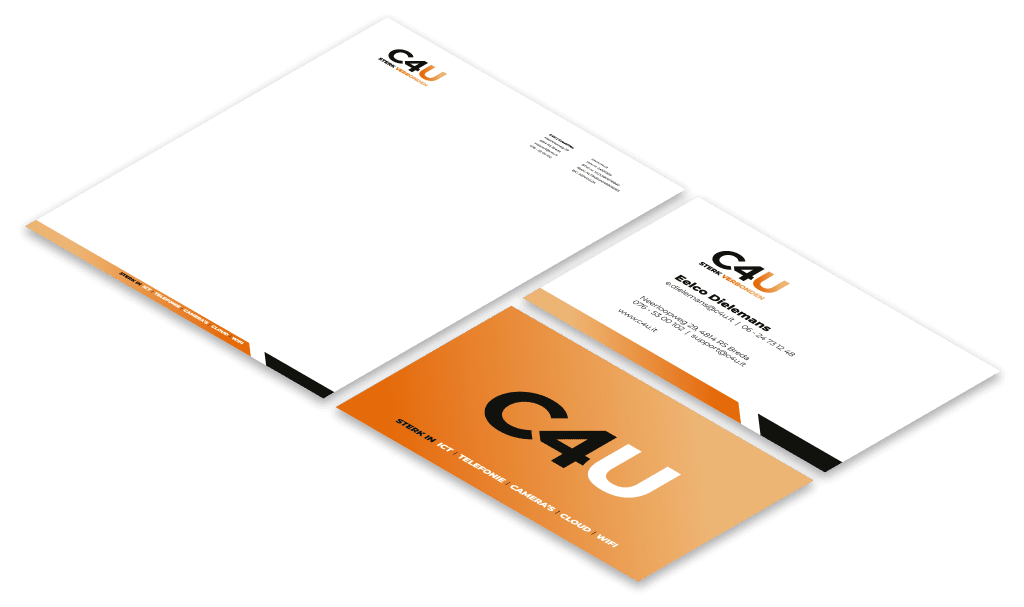
New LOGO,
NEW PRINTINGS
From writing paper to business cards

From offline to online
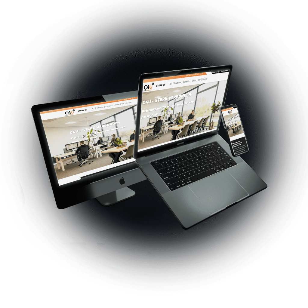
Website
The corporate identity and graphics have also been implemented into the website, of course. Thus, we extend the look of offline to online and ensure a consistent look and feel.
C4U’s services are clearly displayed and, through the photography, C4U’s employees also connect with the website and the brand. This way the personal touch is also reflected digitally in the design. C4U’s website is built in WordPress and fully responsive, providing a nice user experience on all devices.
strong result
Het resultaat van dit gave rebrandingproces mag er wezen en hier zijn wij dan ook heel trots op. Wij bedanken C4U en Eelco Dielemans in het bijzonder voor het in ons gestelde vertrouwen. Wij kijken uit naar een verdere intensivering van onze sterke samenwerking en blijven graag verbonden.
READY TO GROW?
Wil je jouw case, uitdaging of groeikansen eens samen met ons bespreken, geheel vrijblijvend? Daag ons uit en plan een afspraak in of neem contact op.